The Importance of Combining Shape and Color in Pottery
The Importance of Combining Shape and Color in Pottery
-
Creates a Strong Visual Impact
-
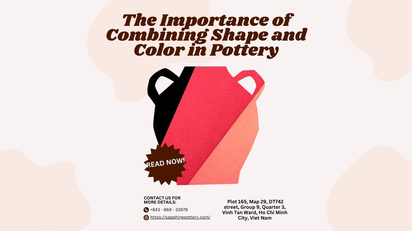
Shape gives the pot its form, while color brings it to life.
-
A well-matched shape and color combination can instantly catch the buyer’s attention and make the piece memorable.
-
-
Enhances Style & Theme
-
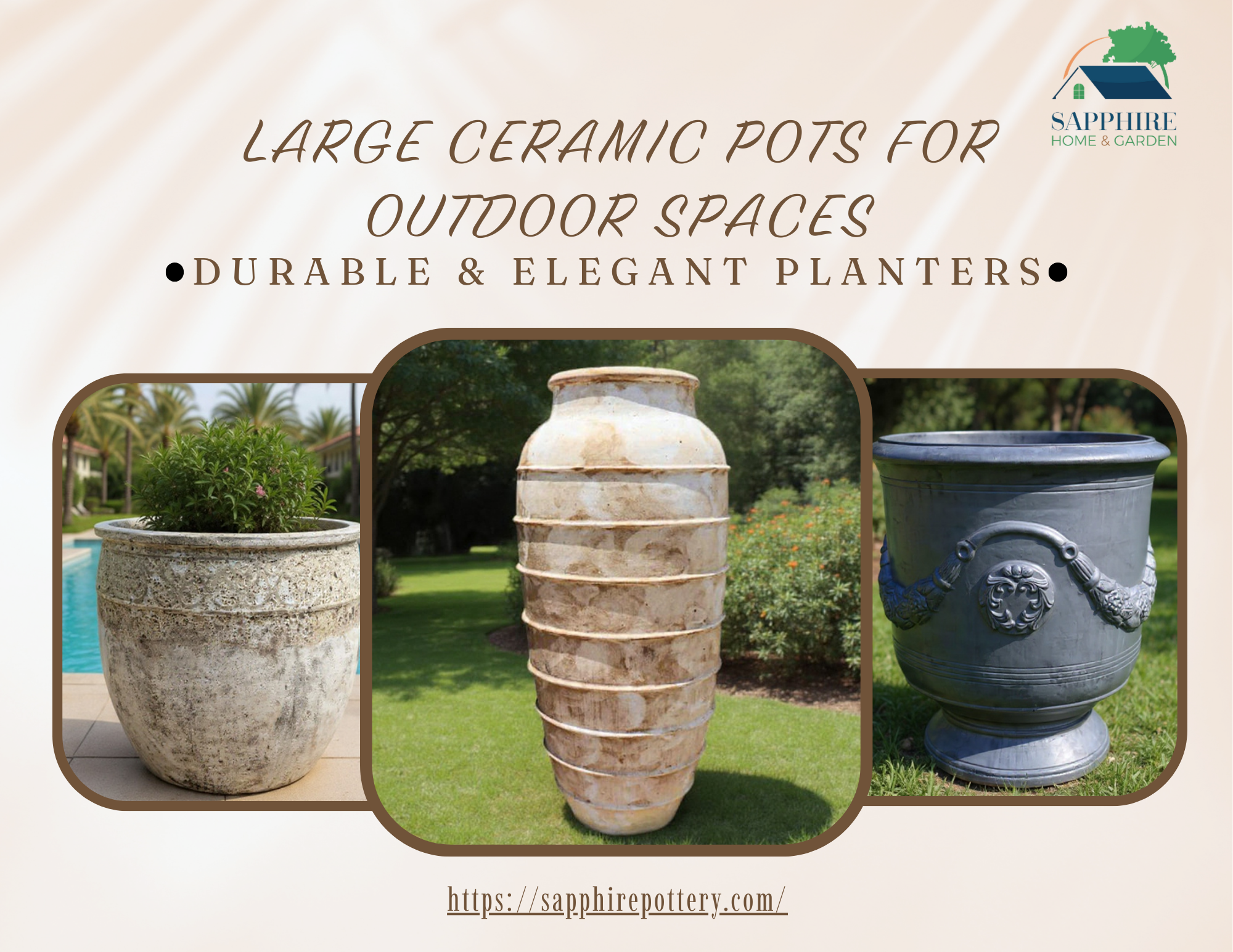
Classic shapes often pair beautifully with neutral or earthy tones for a timeless look.
-
Modern or unique shapes can be elevated with bold or contrasting colors to create a contemporary style.
-
-
Highlights Craftsmanship
-
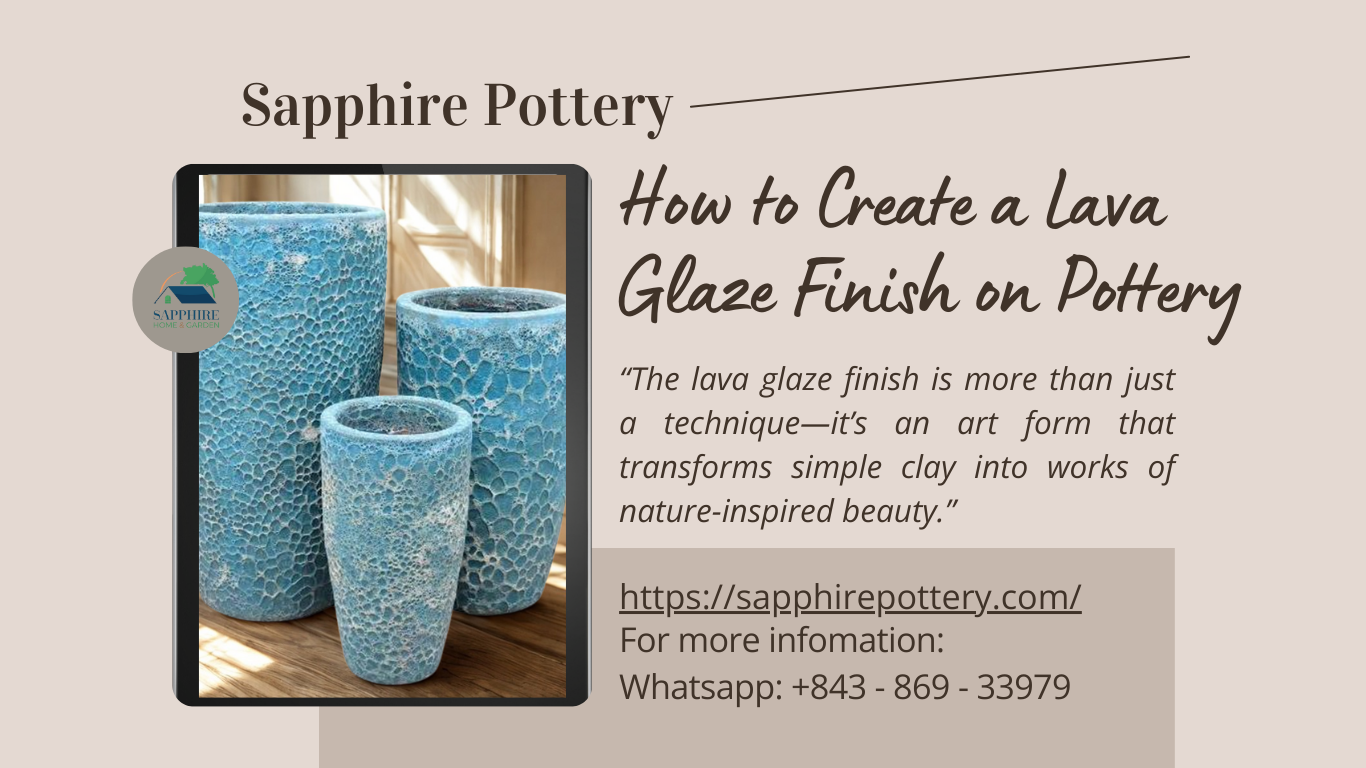
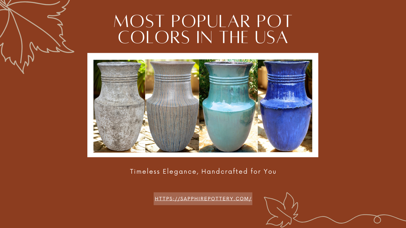
The right glaze color can emphasize the curves, edges, or textures of a shape.
-
Light or glossy finishes can make soft curves look more elegant, while matte or rustic tones enhance handcrafted details.
-
-
Supports Brand Identity
-
Consistent shape–color combinations help customers easily recognize your brand’s style.
-
For example, a signature “tapered pot in deep blue” can become your trademark look.
-
-
Influences Customer Emotion & Purchase Decisions
-
Colors evoke emotions (calm blues, energetic reds, natural greens) and, when matched with the right shape, can influence how customers feel about the product.
-
This combination often determines whether a customer sees the piece as “ordinary” or “must-have.”
-

